

Transform Customer Experience on Websites
Project Details
Duration: 2 months
(Launched in Aug 2020)
Role: UX Architect, Content Strategy
Process
Data Analytics
User Journey
Hypotheses
Streamline Information Architecture
Validation with Wireframes
Prototyping
Success Metrics
-
Increase in download rate
-
Increase in upgrade rate
-
Lift average time of users finding information
Background
This website UX improvement project aims to conduct hypothesis-driven lean UX design to improve the workflow and streamline the journey to drive sales on websites.
Goals
Reorganize the information architecture
1. Make navigating on the site easy and smooth
2. Present the complex information in a clean way
3. Establish a sense of place and clear relationships within the page content
Design Process
User Journey Map
Starting with mapping out the user journey of our website, our business goals, and the current site map to identify the areas that we can work on for improvements.
Data-Informed Hypotheses
I monitored session times, bounce rates, goal completions, and user behaviors on Google Analytics. We formed the design hypotheses of each phase based on the analytics, and discrepancies between the sitemap and the user journey.

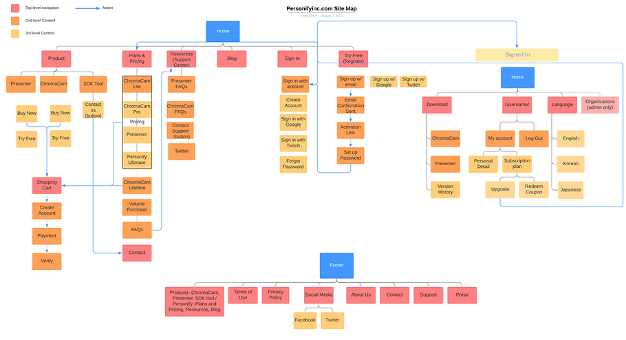
The old site map shows a messy architecture of the workflow
Hypothesis-Driven Ideation
The ideation phase is based on translating key observations and opportunities into actionable solutions. I worked with different internal stakeholders on the brainstorming, including using deliverables to explain the UX concepts.
Problem-Solving with Wireframes
Concept 1: Download
Problem statement: Users were unable to see any sign of "download software" in the previous journey without log-in, they must sign up an account. This led to a high drop-off rate after landing on the sign-up page.
Hypothesis: Products should be available to download without log-in and easily accessible. All versions should be accessible regardless of users' operating systems.

Cleared up the information architecture on the site map while putting download in the navigation bar.

Users are able to download both Wins & Mac versions of the software while getting informed with the requirements, and a link to all the previous versions on one page.
Concept 2: Support page
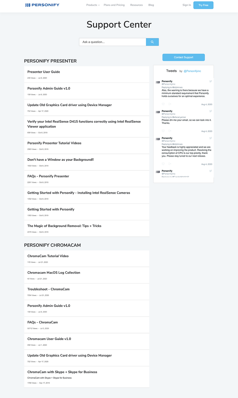
Problem statement: The previous FAQs of both products were hidden inside all the resources. By clicking FAQs, it brought users to an article with all kinds of questions (without order) listed in it. The way it was presented led to countless of support tickets every day because users couldn't find the information they need, would rather jump to contacting us.
Hypothesis: Unify the name of the support pages, put everything in one page, and re-organize FAQs to make it more accessible.

1
2
3
1. The new design of FAQs greatly utilized the collapse pattern to keep the layout clean when other information is not needed. Questions are categorized under 2 software, between "General" and "Troubleshooting". Tips go to "Featured Articles".
2. Questions are listed in links form and by clicking it, users will see the answers expanded (please refer to the image below). Save the time for users to find the answers by themselves.

3. Users can directly access the support form once they enter the "support" page from the navigation bar, which greatly shortens the journey of post-sales support.
I also designed the mobile version to ensure the accessibility of all devices.

Validation
I presented the mid-fidelity prototype of the new design to 7 users for usability testing and 95% able to successfully achieve the goal of
-
Exploring and understand the products (Awareness)
-
Easy access to software (Consideration)
-
Shorten the time of finding solutions to designated problems (Post-Sales)
Therefore, we moved on to high fidelity prototyping and staging.
Prototypes

Reorganize information architecture, design graphics and copywriting.

Reorganize information architecture, design graphics and copywriting.
Reorganize information architecture, design graphics and copywriting.

Reorganized FAQs using collapse pattern clean up the page.

Reorganized FAQs using collapse pattern clean up the page.

Reorganized FAQs using collapse pattern clean up the page.
Results & Takeaways
After the new IA and design are implemented, we've seen a tremendous increase in the download rate since users are able to easily access to try the software. Moreover, an increase in the subscription rate as the content on the website gives clear messages on the capabilities of our products. Last but not least, the number of support ticket decreased significantly as FAQs is easily accessible.
As our team took the Lean UX approach on this redesign project, we need to keep monitoring live site data in Google Analytics and iterate accordingly.