

Madison College Library Website Redesign Project
Project Details
Duration: Sep 18 - Dec 10, 2019
School: University of Wisconsin-Madison
Course: Introduction to Info Architecture and Interaction Design for the Web
Challenge: Improve information architecture and user experience for an existing website
Process
User Research
Site Analysis
Persona
Information Architecture Strategy
Wireframe, Prototype
Usability Test, Iteration
Tools
Pen & Papers
Google Form
Lucid Chart
Adobe XD
Adobe Illustrator
Basecamp (Project Management)
Background
The School library plays a critical role for students and teachers in their learning. Libraries ensure users to have easy access to quality information and resources, help them to enhance their study and research skills. As one of the most useful tools, the library should always aim at a good user experience. My group chose to redesign the Library & Academic Support Services of Madison Area Technical College (MATC)’s website (https://libguides.madisoncollege.edu/) for our project since it is evident that there was a low clickthrough rate with services. Furthermore, users struggle to find the resources they need even after scrolling through the page multiple times. Hence, our project aims to improve the user experience and revive its purpose of a library website.
Research Takeaways
Pain Points
Based on our research, we identified the following pain points of users when they are navigating the Library website.
-
Messy and complicated user journey causes users to leave the service (short session rate).
-
Confusing navigation bar (mixed with items from MATC school website)
-
Excessive information on webpages without organization, " Would rather approach librarians directly."
-
The inconsistencies of vocabulary used on the website confuse users.
-
-
The value of the library service is being depreciated due to the structure of the website.
-
The search feature on the homepage does not play its role (contains irrelevant information and without a full searching feature).
-
Some important features are hidden as students do not know they exist, or the user journey is too long (e.g. Calendar, Tutoring Service.
-

Example of the excessive information on the resource page
Design Process
Different User Types
The main users of the MATC library website include,
Students:
.png)
.png)
Teacher/Staff
Problem-Solving
The user research, evaluation, and card-sorting results play a significant role in our decision-making during the wireframing phase. We also upheld the idea of...

We focused on the 2 main areas, which are the redesign of the organization system and the navigation system.
● Organization system
Initially, the website presents all the information it has on each webpage, which has been counterproductive because it is too much. Users would either give up on looking for information or take a very long time to find it. Our strategy of reorganizing the information on the website is to utilize drop-down menus to avoid excessive information. It might take users one more step, but when users enter the site, they have a very clear and structured view that speeds up the time to find what they need.
● Navigation system
The current navigation combines the MATC school website's navigation system in addition to the library's, which confuses users and makes it difficult or takes extra steps for users to reach what they want. Therefore, our main focus here is to remove all the non-library links from the navigation bar and separate the MATC website's shortcut into a drop-down menu on the top layer of the bar. We used color to differentiate the links of the MATC website and the library. We chose the full name of this college over its logo to avoid distraction from the library logo.

For the second layer of the bar, all the links are from the library website. Our strategy better differentiates the links from the main MATC website and the library, as well as makes it easier for users to navigate.

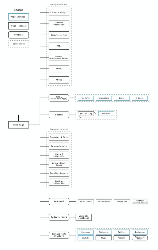
Sitemap's Before and After as the navbar being cleaned up
Validation
We conducted usability tests with 5 participants in the MATC library, including 3 faculty members and 2 students with our paper prototypes.
We found out the following items that would require further iterations.
-
Some users failed to find items under the categories sorted.
-
Some services took a long time to be found, e.g. tutor schedules and LinkedIn Learning.
-
60% of our participants misunderstood it as the search box for the entire website

Conducting usability test in MATC library
Solution


We iterated our final design based on the results and analysis from the usability test, in order to maximize the user experience by providing an even more intuitive website from our initial redesign.
-
Moved "Avoid Plagiarism Tips" in to "Research Help" section.
-
Changed the name of "Computer Help" to "Computer & Tech".
-
Changed the name of "?askalibrarian" to "FAQs".
-
Moved the location of "Tutoring Schedule" to the left-hand side of the webpage but enlarged the font size based on F-shaped eye pattern with a star icon.
-
Optimized Home page Layout by providing a more unobstructed view on the website and more organized in terms of visual experience.
-
Optimized the IA layout of the Research Help page & Computer & Tech's icon by giving up the 2- column layout and categorized the drop-down menus into sub-groups of resource and citation for easier browsing experience.
-
Beautified the UI of the website. Adopting the color theme of the original MATC website. Adding MATC's image to the search box's background Search box, choose the images that are more minimalist instead of being too colorful and distracting for the frequent links on the home page. As well as re-design some icons as shown below.


Conclusion
From the website’s mission and vision, user research, to website analysis, we completed a comprehensive examination of the current library website. According to the information we collected, we redesigned the structure and wireframes of the website. Additionally, after paper prototype testing, we made further adjustments and refined our design to a high-fidelity prototype. We are very confident that the redesigned website would have better usability compared to the current website. However, the number of interviews we had and the survey responses we received were limited. Another improvement that could be made is the mobile website. Based on the survey, we found out that users use the mobile website differently compared to using a computer site. Due to the scope of this project, however, we could not redesign the mobile website.